
30-second summary:
- There are ways to save and optimize your SEO budget, here’s how
- Start with creating an “at a glance” report comparing your competitors’ key metrics. Find interesting trends to look further into!
- Analyze and monitor your competitors’ online sentiment and customer satisfaction. How can you become better than your competitors?
- Identify your competitors’ marketing priorities by looking at their competitors’ PPC tactics. Note their branded keywords they are bidding on: what do they consider their competitors?
- Research your competitors’ branded questions by analyzing “People Also Ask” and monitoring tweeted questions from their customers and brand ambassadors
- Analyze your competitors’ social media marketing tactics: what can you learn from these and which should you avoid?
1. Competitors at a glance for domain analysis
You can never have just one competitor in the real world. In some niches, you’ll end up with ten or more competitors that need your attention. Where to start?
This is the section I usually start my competitive report with: competitors at a glance which is a chart letting me easily compare my competitors.
What should be included in this section?
This section includes any metrics that would allow you to spot some key trends:
- How new or old is this competitor?
- How many backlinks has your competitor managed to acquire?
- What’s their website traffic?
- How large is the website?
Seeing all these numbers side by side often allows you to see important niche patterns or spot some interesting cases to explore further. For example, you can identify a new competitor that nonetheless gets a lot of organic traffic. Or you can find a competitor with fewer backlinks that managed to build solid web visibility. These are both good cases to learn from.
Here’s an example of how I use an “at a glance” method for my competitive research that is also color-coded based on how successful each competitor is (green showing very good numbers).
Source: Screenshot made by the author
2. Online sentiment and customer satisfaction
How happy are your competitors’ customers? Is there an opportunity for your product here? Is there a particular feature or aspect that makes your competitors’ customers unhappy?
Knowing why your competitors’ customers are unhappy helps on many levels, from learning the mistakes you need to avoid, to developing a better product that covers a niche gap.
So why do so many competitive reports fail to include this section?
And that report is pretty easy to generate. Sentiment analysis and monitoring are doable with some advanced social listening that dives into the segmentation of consumer sentiment.
 Source: Awario
3. PPC keywords
Most competitive reports include organic keywords and positions but how about PPC keywords?
Whether you are planning to invest in paid ads or not, knowing your competitor’s PPC keywords will help you understand what they are focusing on. It’s a smart way to understand high and low competition keywords without having to spend your own dollars.
When looking through my competitors’ PPC keywords, I always pay attention to their branded keywords. Firstly, it shows the competitors they as a business take seriously. And second, this may inform my own PPC decisions as there’s a solid case for bidding on branded keywords because they tend to have high intent and are often cheaper.
Here’s an example of a branded keyword report from Ahrefs. Notice the ‘Traffic’ column estimating the number of clicks a particular PPC keyword is bringing to the target site:
 Source: Screenshot made by the author
4. Branded questions
Niche question research is useful on many levels but have you ever given a thought on how useful it is for your competitive research? Questions people ask about your competitors will give you valuable insight into:
- Your competitors’ drawbacks (and how you can practically fill that need gap in the market)
- Your customers’ failures (and how to avoid them)
- Your target customers’ journeys (and how to best approach them)
When it comes to understanding your niche buying journeys, Google’s People Also Ask results, also known as ‘intent questions’ help you understand and visualize all the different paths consumers are taking when making their buying decisions.
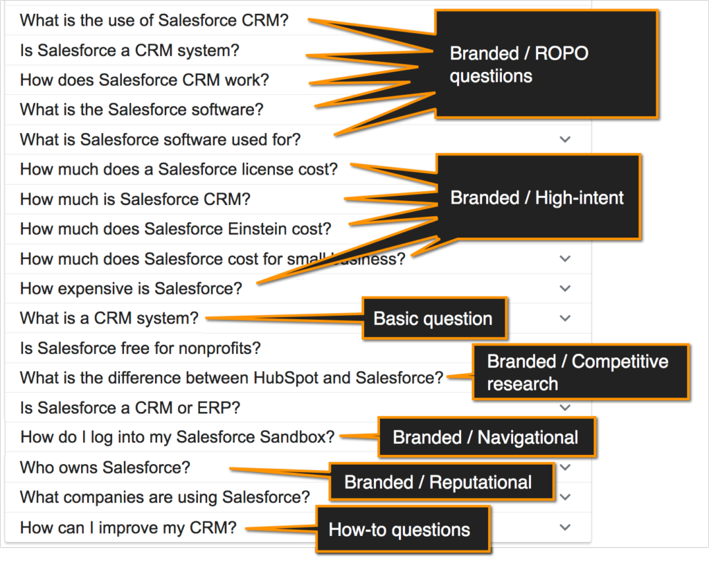 Source: Screenshot made by the author
Always take note of the “People Also Ask” results when searching for your competitors or their products. These help you better understand your target customers’ interests and research styles throughout their buying journeys.

Source: AlsoAsked
You could also use some freemium-based tools to keep track of questions your competitors’ customers are asking in real-time, use Twitter question search which can also be monitored through a free app called Tweetdeck. Create a new column in your Tweetdeck to monitor this search term:
[competitor ?]
Make sure there’s a space in between your competitor’s brand name and the question mark.

Source: Screenshot made by the author
5. Your competitors’ promoters
Who are your competitors’ most vocal promoters? Can you get them on board to promote your brand instead? Or how did your competitors manage to win their love?
Your competitors’ friends are not your enemies. These are people who may fall in love with your product or agree to collaborate on similar or better terms.
Checking your competitors’ backlinks is the most popular way to find their promoters but it seldom includes people behind those links.
Social media is another great place to look for your competitors’ promoters.
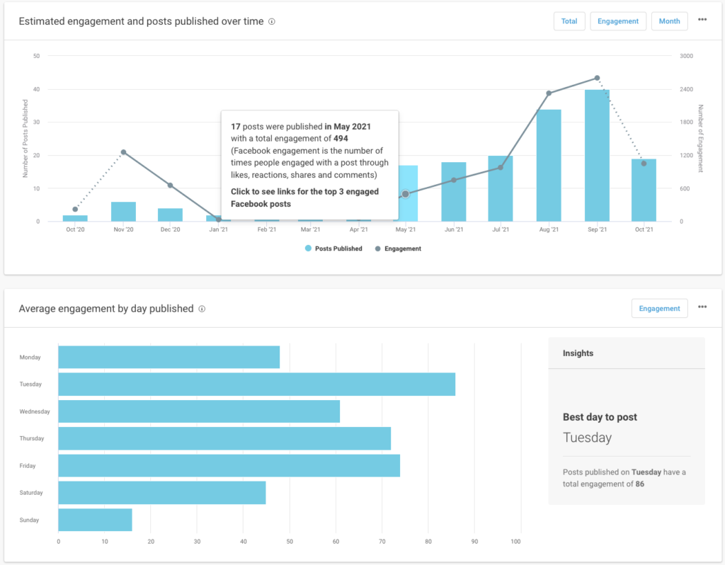
6. Social media content
Are your competitors using social media to find and engage your customers? There are some lessons to learn there as well.
You can run a solid analysis of any Facebook page engagement metrics which you can use for your competitive report:
 Source: Screenshot made by the author
Conclusion
Competitive research is much more than tracking your competitors’ organic positions and checking their backlinks from time to time.
It can give you a lot of insight into your target customers, their struggles, and buying journeys, it can teach you to build a better project and identify niche gaps. Finally, it can help you identify mistakes to avoid and build a stronger business. Good luck!
Ann Smarty is the Founder of Viral Content Bee, Brand and Community manager at Internet Marketing Ninjas. She can be found on Twitter @seosmarty.
Subscribe to the Search Engine Watch newsletter for insights on SEO, the search landscape, search marketing, digital marketing, leadership, podcasts, and more.
Join the conversation with us on LinkedIn and Twitter.